
The role of web design goes far beyond brand aesthetics. In fact, one research found that 48% of people said that they consider website design as the number one factor in determining business credibility. It makes sense as humans are visual beings, so entrepreneurs really should start investing more time and money on the very foundation of a strong online presence.
A business website should not only reflect your brand’s personality, it should also serve a purpose – provide the best customer experience as that is a great way to boost conversion. To give you an idea, here are 11 ways you can redesign your website to improve conversion without sacrificing brand personality and visual identity:
1. Make Call-to-Action buttons identifiable

Place it inside a container, choose a specific pop of color, and make its size bigger than any other content of your page. Whatever combination you decide on, just keep in mind that your CTA buttons should be easily distinguishable. CTAs are the bedrock of conversion funnel, so make sure to highlight it in your web pages. Every other content on the page should act as guides on why a user should “Add to Cart,” “Buy Now,” or “Book an Appointment.”
To evaluate how distinctive your CTAs are, do the squint test and see if you can still distinguish your CTA.
2. Follow the Rule of Thirds
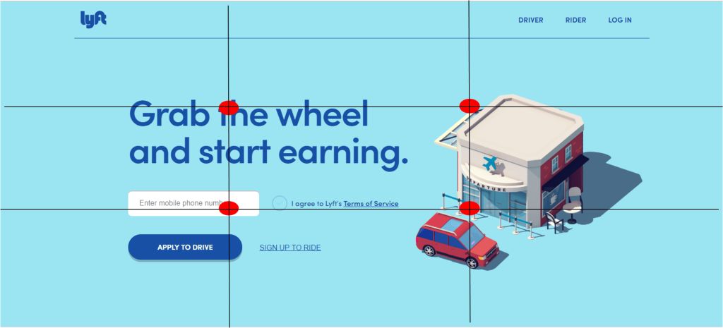
While the rule of thirds is a principle used commonly in photography, it is actually applicable in web design as well. You can implement this by visually dividing a site page into thirds which will result in two equally-spaced horizontal and vertical lines and a total of nine equal squares.
The rule of thirds helps you determine the strategic places that will best house your website’s most important elements – the four middle sections where the lines intersect. That could either be your CTA button, your top-selling product, or your most impactful piece of media or content.
3. Implement Directional Visual Cues

If having the CTA clicked is the basic objective of your page, then it will be beneficial if you are able to use directional visual cues to help lead users into it. Directional cues can come in two forms – explicit, which are direct to the point such as arrows and lines; or implicit, which are more subtle like through color contrast or white space. The basic idea of visual cues is to direct a user’s attention on what sort of action you want them to take when they are exploring your site.
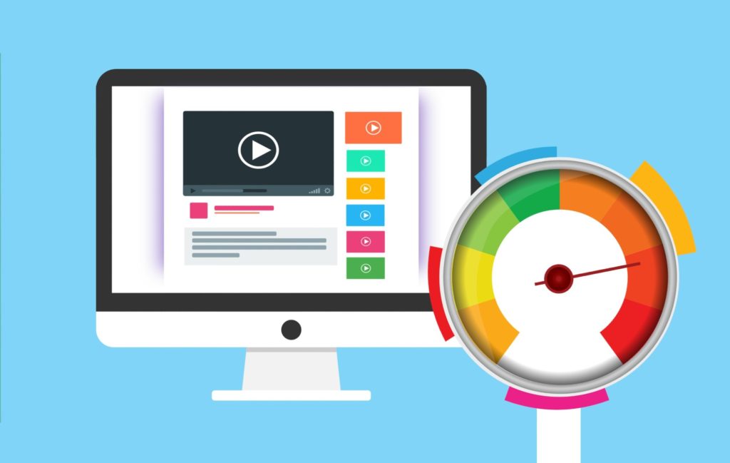
4. Consider Loading Speed

Studies have shown that a 2-second delay in page loading can contribute to a 103% increase in bounce rates. This is why it is crucial that you also design your business website for optimum speed.
This can be a little bit more technical than actual design, but here are some things you can do to increase page speed:
- Minimize HTTP requests
- Minify and combine files
- Do a compression audit
- Enable browser caching
If you are not sure where to start, you can rely on various web accessibility resources and tools such as Google Pagespeed Insights and GTmetrix. These will help you evaluate your website’s speed performance and even provide recommendations on how you can troubleshoot issues.
5. Understand the value of negative space

A site’s negative or white space is the part of the page that does not contain any sort of text or media content. Unlike sites published in the early days of the internet, it’s not good practice to literally maximize every space of your website and fill it with content.
Your site should be designed in a way that it looks organized and less crowded. You can leverage on negative space to help users distinguish the key elements of your website and enable you to improve content eligibility, create balance, and highlight actionable items.
6. Apply the F-layout
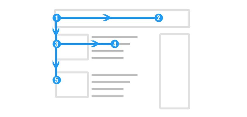
When it comes to browsing web pages, users have a natural tendency to go through it in an F-pattern. They usually look from left to right beginning at the top of the page and eventually just scanning their way down to the bottom. Based on this behavior, you should design your site page in a way that the principal elements and main message of your brand is placed on top as that gets the most amount of attention.
7. Choose colors wisely

Sending a brand message across is one of the main goals of having a business website, and color psychology plays a role in that. Different colors can evoke varying emotions and could also affect how your brand is perceived by your target audience, so do take time to choose the colors you will be using.
One thing you can do that will help you come up with great color combinations is curate a Pinterest board. Pin images that strike your fancy and are aligned with your ideal brand aesthetic. Afterwards, you can use Adobe’s Color Wheel to upload your pinned images and it will automatically provide you a color palette based on those.
8. Use faces to increase familiarity
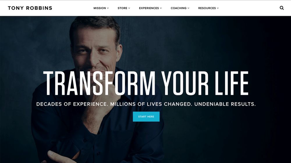
Research has shown that using actual people on your visual content can boost site conversion as it establishes a better feeling of connection with users. As much as possible, invest in real photography and don’t use stock photos as consumers tend to view it as more authentic and personal.
9. Abide by the 8-second rule
Humans have a very short attention span (even shorter than a goldfish’s). In fact, you only have 6 to 8 seconds to engage your audience, so make sure the first few elements they see on your site is enough to get them hooked. Choose an impactful hero image or video, use a benefit-driven headline, place a CTA, and have content that is concise and compelling.
10. Utilize Hick’s Law

Hick’s Law , named after British Psychologist William Edmund HIck, states that the more choices you offer a person, the longer the time it will take for them to come to a decision. To boost conversion rate on your website, limit the content on the navigation bar and just focus on the money pages you want them to really explore. This is why most sites only have “Home,” “Services,” “Pricing,” and “Contact Us” as part of their menu bar as this structure minimizes friction.
11. Do K.I.S.S.
K.I.S.S. is a popular, easy-to-remember acronym that stands for “Keep it simple, stupid.” This is directly related to Hick’s Law which revolves around the idea that simplicity is one of the key drivers of website conversion. Keeping content and design direct to the point not only makes it easier for users to navigate your site, but also allows you the flexibility to design elements in a more visually-appealing way. This is why minimalism continues to be a growing trend in the web design and branding industry.
Final words
The basic idea of great web design is not rooted in visual branding, but in digital customer experience. As long as you understand your target market’s online behavior and their goal in visiting your site, then boosting conversion through web design becomes much easier.